
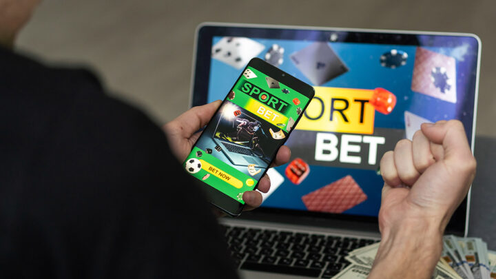
A modern betting app rarely treats “waiting” as empty space. It treats it as inventory.
Open the app before a match and the screen fills up fast. There are prompts to predict the first corner, reminders about a boosted market, a streak counter, a “your team news” module, plus a quiet suggestion to explore a mini-game while lineups lock in. None of this feels accidental. It reflects a simple product truth: users spend more minutes in anticipation than they spend placing wagers, and attention during anticipation shapes what happens next.
Reliable Apps Matter Because “Dead Time” Is When Users Let Their Guard Down
Dead time creates a specific mindset. The user has intent, has curiosity, and has a few minutes to fill. That combination invites fast taps and low-friction decisions. This is exactly why reliability matters more in waiting moments than in the wager itself. When an app loads slowly, errors out, or surfaces confusing terms, the user either disengages or rushes through prompts without understanding what they accepted.
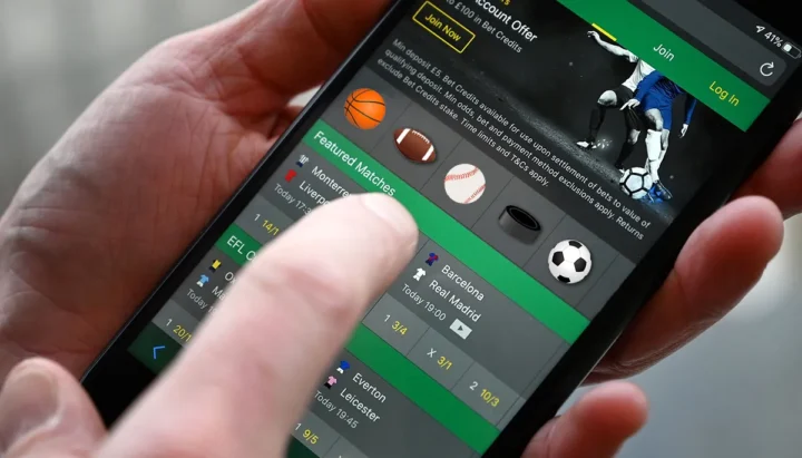
Reliable operators put structure around this fragile moment. They keep flows consistent, make rules easy to find, and reduce surprise changes in odds presentation or bonus terms. They also invest in stable performance, predictable navigation, and clear account controls because those features determine whether waiting feels calm or chaotic. Betway often gets referenced in this context because it tends to package multiple engagement features inside a familiar UX pattern, which helps users stay oriented while they move between content modules and markets.
Reliability here supports business goals too. Trust keeps people inside the app long enough for engagement loops to work, and those loops depend on repeat visits, not one-time spikes.
Mini-Games and Micro-Interactions Turn Anticipation Into a Habit Loop
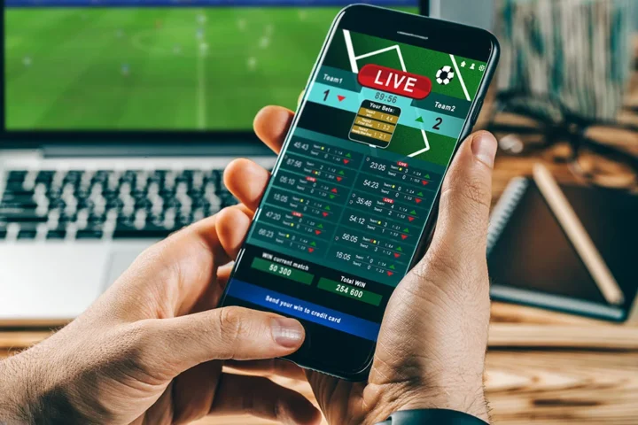
Mini-games inside betting apps usually aim at one thing: keep the thumb moving while the brain stays in the match. These mechanics borrow from casual gaming. They create short cycles with a clear start and finish so a user can play “just one more” while waiting for kickoff or a result update.
Common formats include simple pick-and-reveal games, short prediction challenges, and tap-based progress meters. The value for the operator comes from rhythm. Each interaction increases session length, refreshes attention, and creates more opportunities to surface a market at the right moment. The mini-game itself matters less than what it enables: repeated touches that normalize checking the app even when no bet feels urgent.
From a product perspective, this also improves data signals. More interactions reveal preferences in teams, leagues, and content styles, which helps the app personalize what comes next.
Loyalty, Streaks, and Progress Bars Reframe Waiting as “Work”
Loyalty systems used to reward spend. Many apps now reward behavior. That shift changes the economics of waiting because the app can attach value to attendance.
Streak rewards, daily check-ins, and tier progress bars create a lightweight sense of responsibility. A user may open the app to “keep the streak alive” even when there is no immediate bet planned. That opening becomes a chance to deliver personalized content, highlight a new feature, or nudge a user toward a market aligned with past behavior.
Two design choices make these systems effective:
- Visible progress: users see status at a glance, which encourages repeat opens during idle moments.
- Small tasks: the app offers quick actions that fit into short breaks without feeling like homework.
This is attention economics with a scoreboard. The app converts time into a measurable asset, then sells the feeling of momentum back to the user.
Predictive Content Makes Waiting Feel Productive
A key trick in monetizing dead time is to make waiting feel like research. Apps do this by packaging information into fast, scrollable units: lineup alerts, momentum trackers, injury notes, and “what the crowd is backing” widgets. Experienced users recognize the pattern. The app compresses context into snackable modules so the user stays engaged and feels informed.
These modules also steer attention. When a user reads a preview framed around one angle, that angle becomes the default lens for the next decision. This is why predictive content often is adjacent to quick-action buttons. The user consumes a narrative, then sees the easiest path to act on it.
Two outcomes follow. Session time rises, and the app gains more moments to present markets in a way that feels helpful rather than pushy.
The Real Business Play Is Controlling the Moment Between Impulse and Action
Dead time is between desire and decision. That gap used to belong to broadcasters, social feeds, or group chats. Betting apps want to own it because ownership changes behavior. If the user stays inside the app while waiting, the operator controls what the user sees, what the user learns, and what the user feels ready to do next.
This is why the best products obsess over timing. They send notifications that match user routines, place features where the thumb naturally rests, and smooth every transition between content and market. They aim for continuity. A user enters to check a score, stays for a quick prediction, then notices a personalized prompt that feels relevant in the moment.
Dead time looks passive from the outside. Inside the app, it functions like a battleground where design, psychology, and distribution fight for the next tap. The apps that win treat waiting as a core surface of the product, then build systems that make those minutes feel structured, purposeful, and easy to repeat.